Usman Qureshi
co-founder & ceo

07:21 UTC+5
07:21 UTC+5
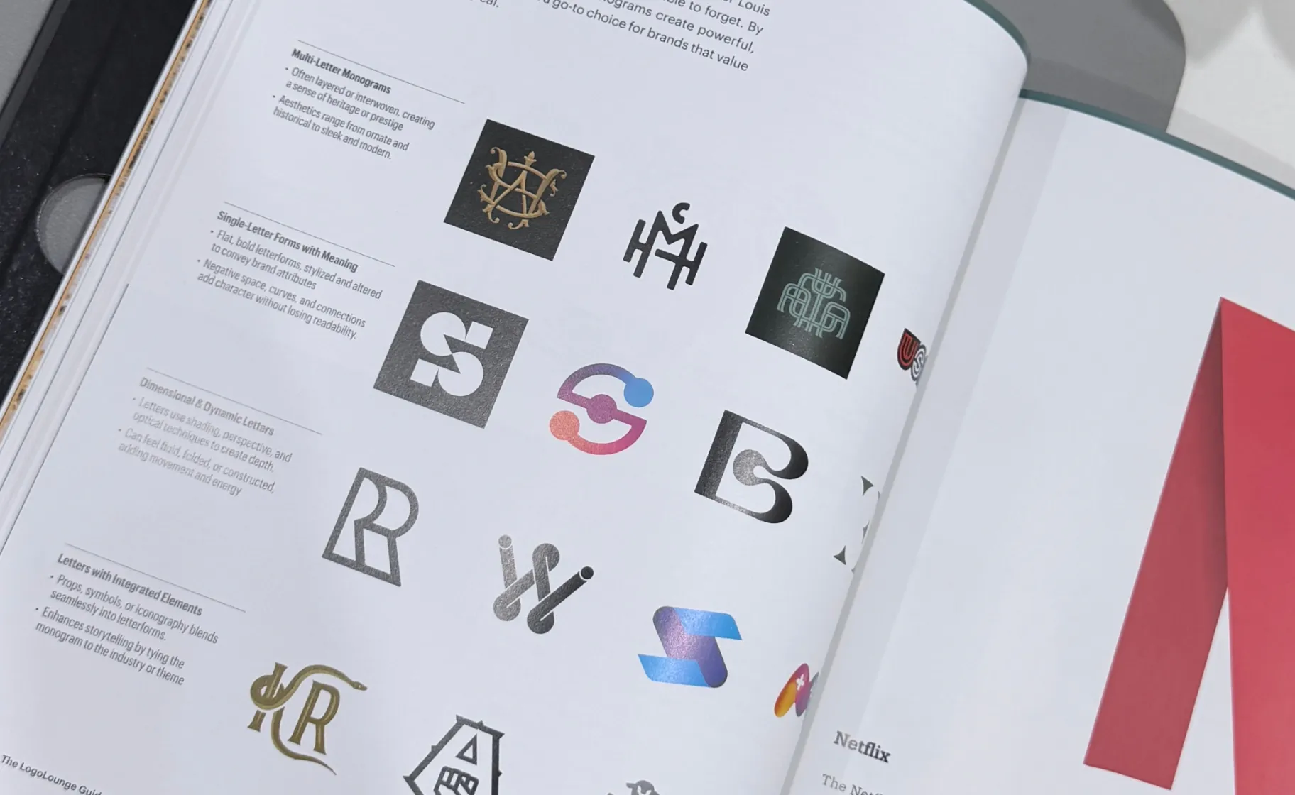
The LogoLounge Guide to Iconic Branding opens with a line about fools and trends. Then it spends 216 pages taking trends completely seriously.
That contradiction is the point. A trend isn't a style worth copying. It's a symptom. Something underneath moved first, usually a tool, a screen, or a shift in what people expect a brand to do when they touch it. The book is interested in the movement, not the surface.
Our work is in it. On the same page as Netflix.
The LogoLounge Guide to Iconic Branding is a 216-page book published by Rockport Publishers that examines why some identities last and others date. It features more than 500 marks selected from the LogoLounge archive, a database of over 400,000 submissions contributed by 20,000 designers across 68 countries.
It isn't an album. The examples are evidence for an argument about direction: identity has moved from fixed symbols to systems that carry motion, sound, interaction, and now some degree of machine behaviour. Each chapter takes one of those shifts and works through it.
Selection into an argument is a different thing from selection into a gallery. The question isn't whether a mark is beautiful. It's whether the thinking behind it holds up once the conditions change.
That's the part we're pleased about.
Most early-stage identities are designed for the company as it exists on the day of the brief. That company is gone within two years.
You'll change positioning. You'll add a product line nobody planned for. You'll move from a marketing site to a product surface, then to a mobile app, then to whatever the interface layer becomes when AI does the navigating. Every one of those transitions puts pressure on an identity that was drawn for a pitch deck.
The identities in this book survive that pressure for a reason. They were built as systems with rules, not artefacts with a favourite lockup. The mark is the visible edge. Behind it sits the typography, the motion language, the tokens, the guardrails that let an in-house team ship for three years without the whole thing quietly degrading.
Get the system right and the mark stays right. Get it wrong and no amount of craft on the symbol will save it.
Four things, consistently:
A system, not a file - Type, colour, motion and spacing rules that govern every future asset, not a single approved lockup.
Behaviour across surfaces - It holds at 16px in a browser tab and at full bleed on a conference stage, in light and dark, still and in motion.
Distance from the category - It doesn't borrow the visual shorthand every competitor is using this year. That's what dates work fastest.
Room for the company to change - The mark shouldn't describe the product. Products get replaced. Positioning gets rewritten.
None of that is visible in the first presentation. All of it decides whether the thing is still standing in year five.
Not much, honestly. We built this way before the book arrived and we'd build this way without it.
What it gives us is external evidence for an argument we make in every kickoff. The brief is never "design a mark." It's "design something that still works when this company has tripled, changed category, or moved onto surfaces that don't exist yet." That's a hard sell in week one. It's easier with a page number attached.
When should a startup rebrand?
The usual trigger isn't age, it's drift. Rebrand when the company has outgrown what the brand describes: a new category, a new buyer, a product that no longer matches the story, or a team that can't ship anything on-brand without asking someone. Most startups are late rather than early — the brand becomes a bottleneck for six to twelve months before anyone names it as the problem.
Should you rebrand before or after raising a round?
Before, if the brand is undermining the raise. After, if it's only untidy. A brand can't manufacture traction, and investors fund a market and a team, not a wordmark. But a company that looks smaller or less certain than it is will spend the round explaining itself. The practical window is the eight to twelve weeks after close, when there's budget and the new positioning is still being written.
How much does brand identity cost for a startup?
Market rates split roughly three ways: a solo designer at $3,000 to $10,000, a studio at $10,000 to $50,000, and a large agency starting around $100,000. What moves the number is scope, not craft, strategy, naming, motion, and a documented system cost more than a mark and a colour palette. Outcraft's brand work starts at $9,500.
Brand refresh or full rebrand — which one do you need?
A refresh keeps the equity and updates the execution: type, colour, motion, application. A rebrand changes what the company stands for, and the visuals follow. If your customers still recognise you and the positioning is intact, refresh. If you've changed category, merged, or built a product your current story can't explain, the visual layer isn't the problem.
Do investors care about brand?
Not as a line item. They care about the signals brand carries whether the company reads as credible, whether the market is clearly defined, whether the team looks like it can execute. Brand doesn't create those. It stops them being misread. That matters most at seed and Series A, when there's little traction data and judgement is being made on other evidence.
We build brand identities for SaaS, tech and AI companies. Positioning, the mark, and the system that holds it together in six weeks, ready for whatever the company becomes after the next round.
Book a callwritten by


INSIGHTS press, talks, and events
ASK AI ABOUT US